PhonePe Dark Mode
About PhonePe
PhonePe stands as one of India's leading FinTech applications, offering a spectrum of services that span from straightforward peer-to-peer money transfers & store payments to the buying insurance and investments and more.
Why Dark Mode?
In addition to enhancing visual appeal, incorporating dark mode into digital products offers the following benefits for users:
1. Reduces eye strain.
2. Enhances user experience by creating a more immersive and comfortable environment.
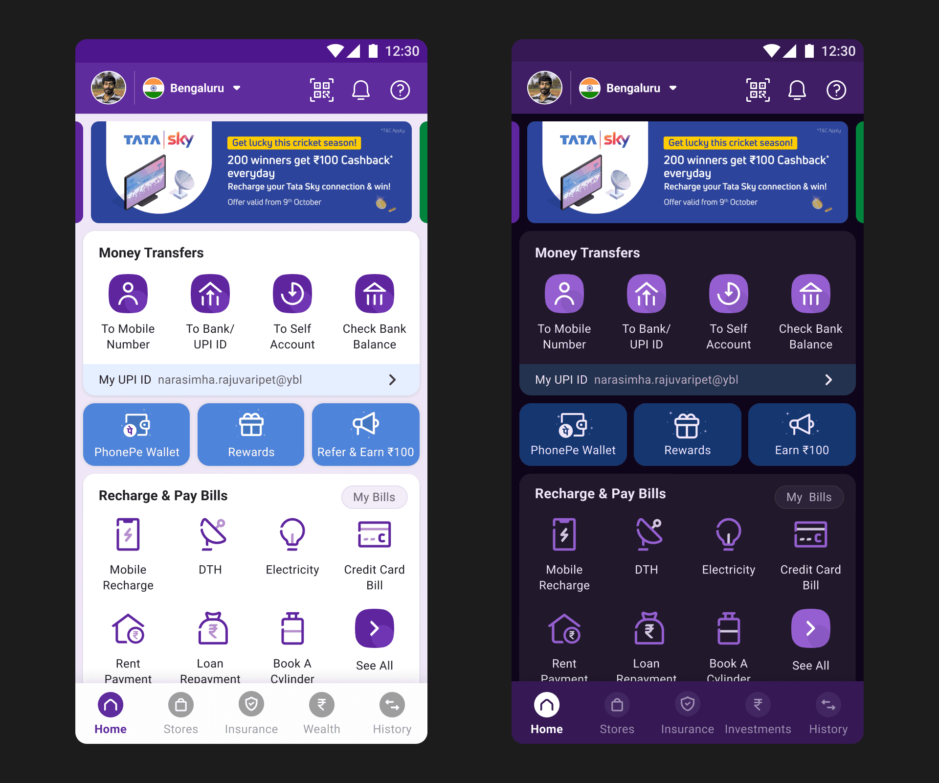
Below shared is a sample comparison between light and dark mode of the PhonePe homepage.
Research phase
In the research phase, we drew inspiration and visual cues from well-executed dark theme applications such as Twitter, Facebook etc. Instead of going with a conventional approach, we decided to infuse the dark mode with a hint of the brand color, elevating its visibility and uniqueness.
Challenges we faced
In the realm of technical design, the implementation of a dark modemay seem straightforward, by identifying colors that correspond to those in the existing light mode.
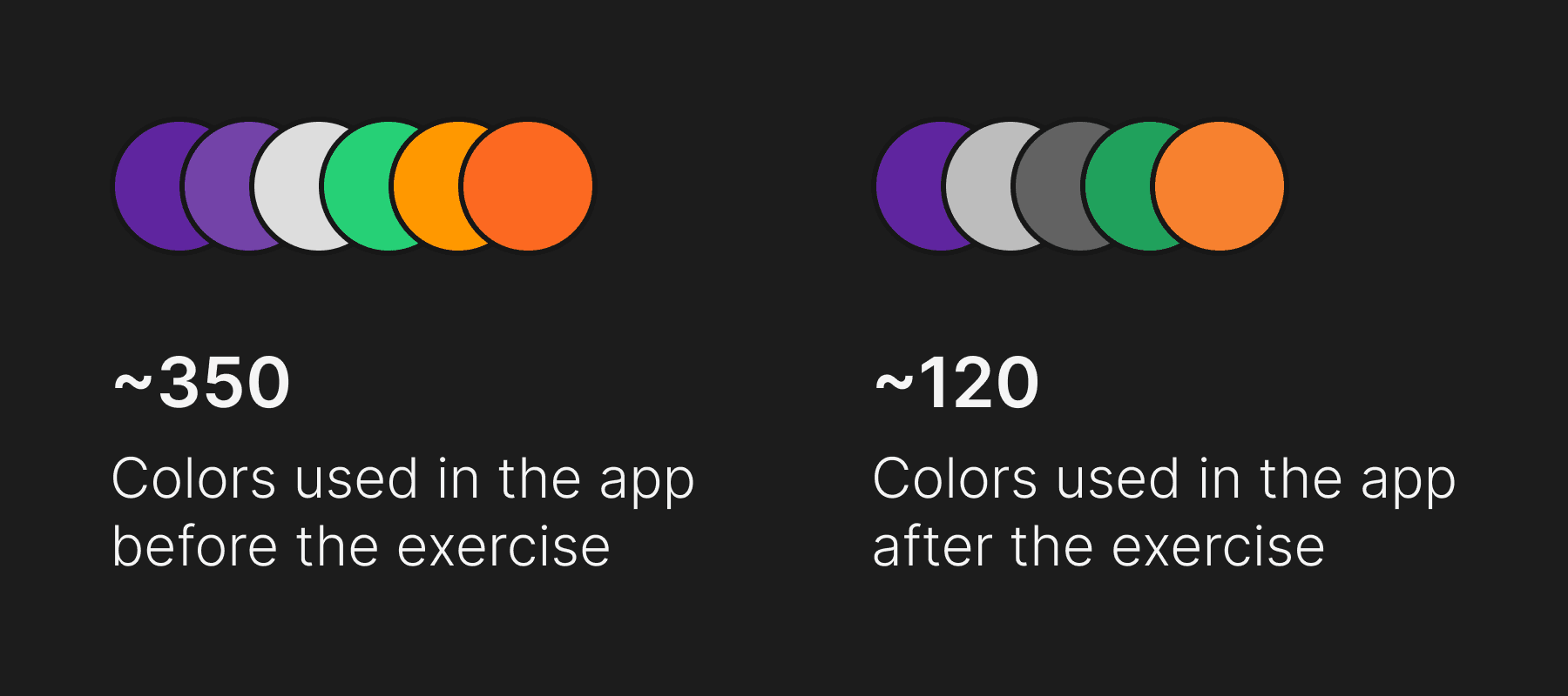
However, our experience at PhonePe presented a unique challenge. Due to less stringent color guidelines, we embarked on an intricate process of optimizing the entire color palette employed throughout the app, spanning millions of lines of application code. Collaborating closely with front-end developers, we meticulously identified and optimised or removed unwanted colors to arrive at a smaller and effective set.
Below shared is an estimated number of colors the team optimised during the dark mode exercise.
Defining the colors for dark mode
After completing the color mapping, we took into account WCAG color accessibility standards to guarantee optimal legibility and usability in dark mode.
Implementation and Rollout
In this project, collaboration played a pivotal role, requiring continuous implementation and testing of screens in tandem with developers and quality analysts.
Additionally, we conducted pre-rollout usability tests with colleagues, identifying a critical insight that white elements on the dark mode were causing strain on users' eyes. To enhance user experience, we strategically infused a hint of purple to white texts and icons.
What Next?